UI Trends in Health & Fitness Apps

UI Trend Research

This project demonstrates my approach to identifying and analyzing UI trends in the Health & Fitness domain.

Product
Digital Health Platform
Target User
Health Coaches α­Ό Clients (End Users)
Role
Product Designer
Team
Danchi Design Studio

Introduction

This UI benchmarking study for theΒ  discovery phase of Health & Fitness app. The app is designed to help trainers support their clients with tools that keep them motivated and build long-term healthy habits.

Market Scan

I reviewed 5 popular Health & Fitness apps from the App Store and Google Play. As of July 2025, each has over 50 million downloads and a rating above 4.0. They all have different visual styles.

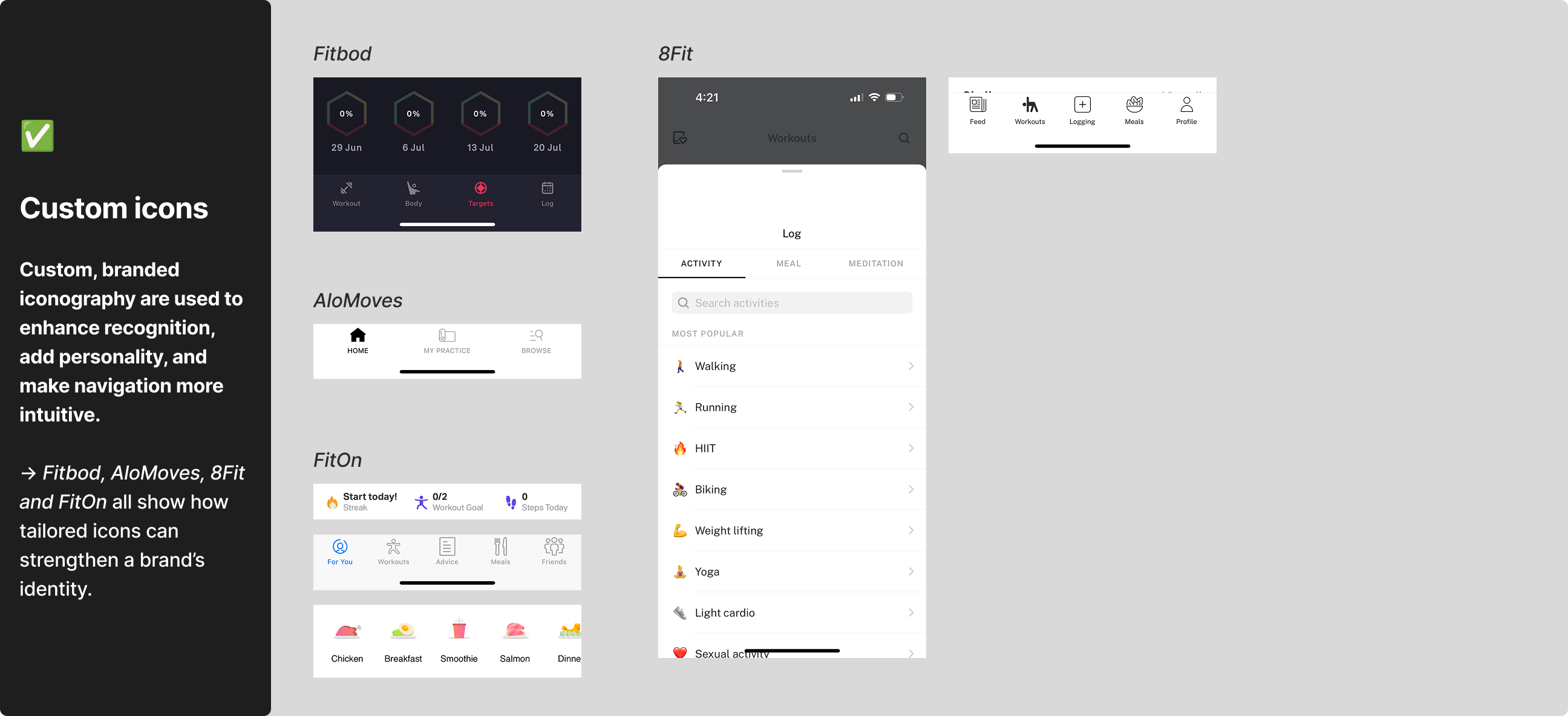
    • AloMoves offers easy-to-follow video classes for yoga, pilates, strength training, and mindfulness. Its UI feels premium and polished.

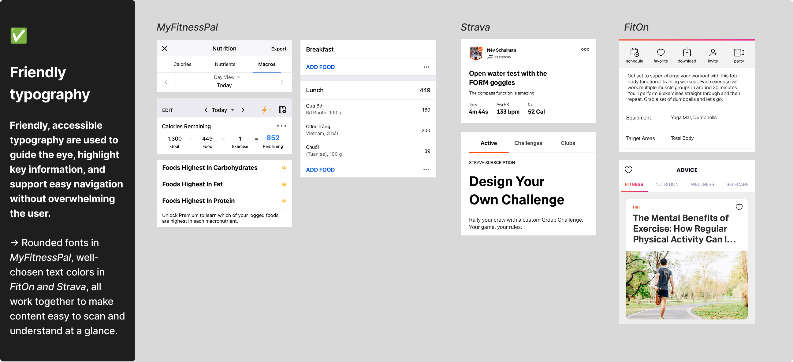
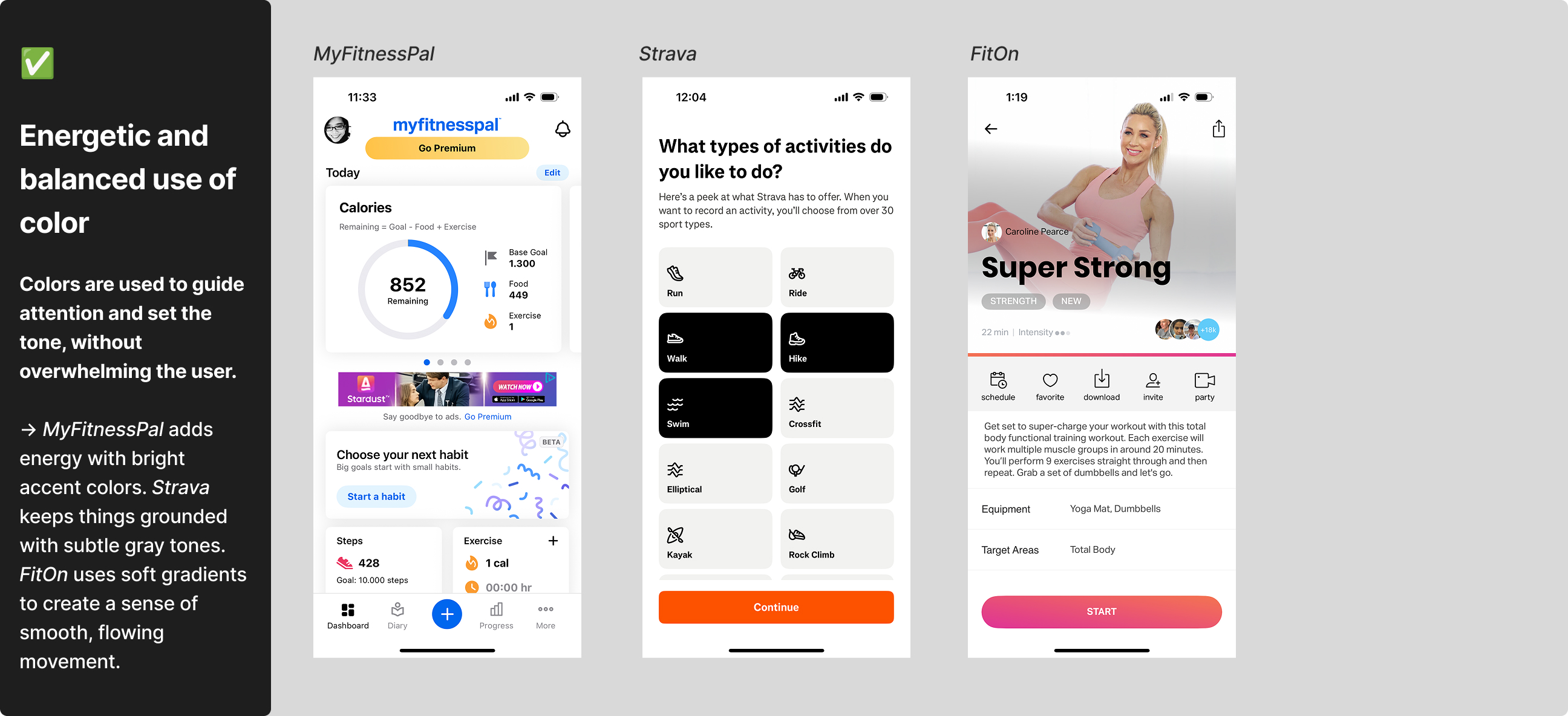
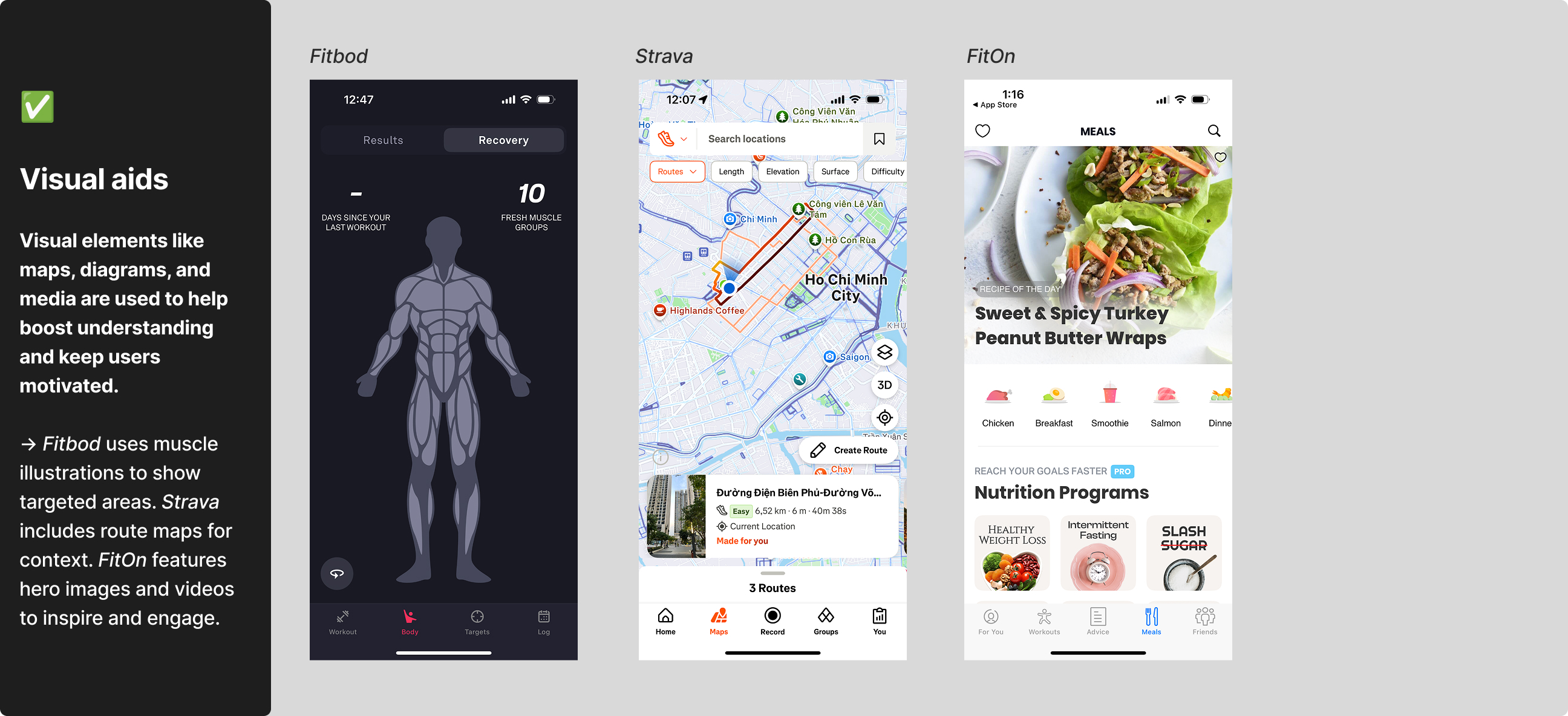
    • Strava is a GPS-based app for tracking running, cycling, and more. It also has social features like progress sharing and community challenges to keep you motivated. The UI is energetic.

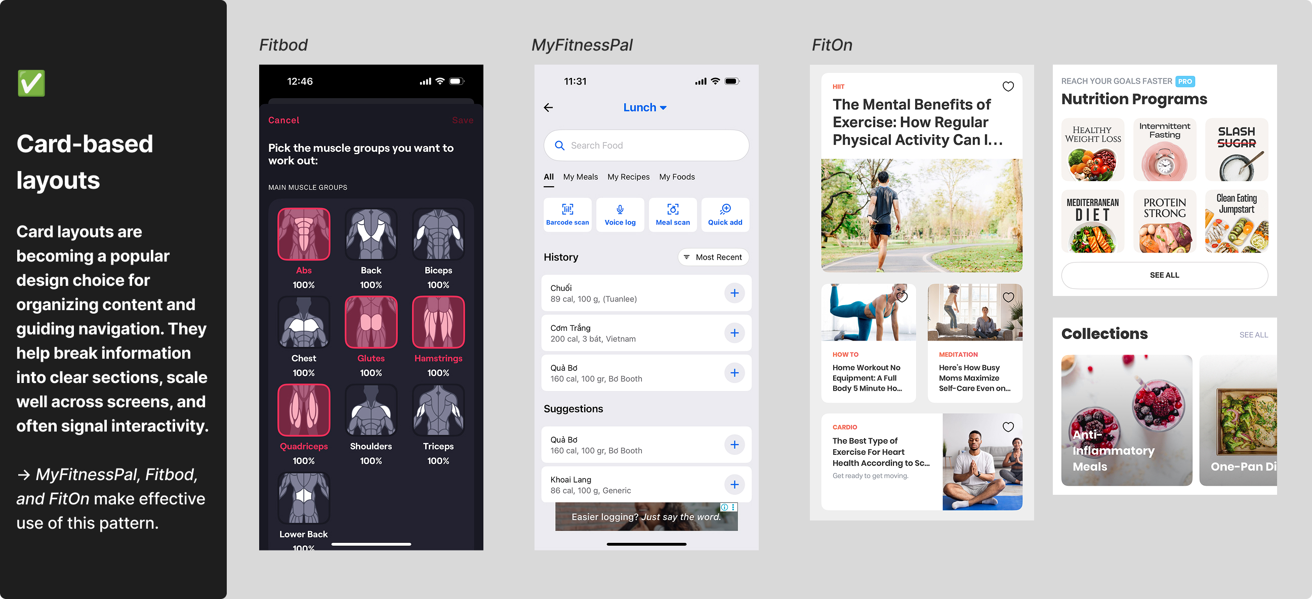
    • Fitbod creates personalized strength training plans based on fitness level, goals, and equipment. The app’s style is sleek and techy.

    • FitOn is a free app with guided workouts for cardio, strength, yoga. Its style is bright and colorful.

    • MyFitnessPal helps users to track food, calories, and daily progress with a clean, functional design focused on easy tracking.

β†’ Take a look at the screenshots and my review notes for more details.

Visual Analysis Summary

The comparison focused on design elements like typography, color palette, layout, images, icons, and visual identity. This helped me identify common trends, highlight what works well, and uncover opportunities to improve visual design in fitness apps.

UI Trends Identified
UI Mistakes to Avoid
Best Practices

Beyond the visuals, I like the smart interaction patterns these apps use. For example, Fitbod’s expandable calendar keeps the screen clean by revealing more only when needed. MyFitnessPal’s drop-downs on the page title give quick access without extra steps. These thoughtful touches make the apps simple and enjoyable to use.

Design Takeaways

For the upcoming Health & Fitness app, I’ll focus on a clean, approachable design that feels both reliable and motivating. Key design choices include:

    • Friendly typography that feels welcoming and makes content easy to scan.

    • Card-based layouts to clearly organize information and support intuitive navigation.

    • Balanced, energetic colors that guide attention and uplift mood without overwhelming the user.

    • Custom icons and visual aids like illustrations, diagrams, and progress visuals to simplify information and keep users engaged.

    • Smart navigation patterns such as collapsible sections and intuitive drop-downs to support a smooth user experience.

    • Avoid design mistakes like poor text readability, harsh color choices, and inconsistent UI elementsΒ to maintain clarity.

I think these choices together will help the app visually communicate motivation and trust, making users feel confident, supported, and focused to reach their fitness goals.